External Design
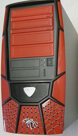
We've seen many manufacturers that will try to put more time and effort into designing a good looking case while paying less attention to the internal features and functionality. We have seen this happen and we have usually seen these products do worse than those that are decent looking with great features.The front of the case is made up of a custom molded bezel, which gives it a look that says gaming all over it. The Xpider II does have a spider theme, but it has been implemented in a clean and meaningful way. The bezel is also unique, since most of the cases that we look at are usually based on another design.
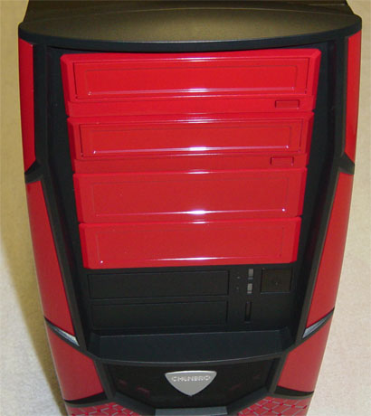
The drive bay covers are painted in one of the 4 available colors to match the rest of the case. The top two 5-1/4" drive bay covers are optical drive bezels, which take away that awful mismatch of color when using a beige colored drive. The bottom two 5-1/4" drive bay covers are the bare type that can be easily removed.
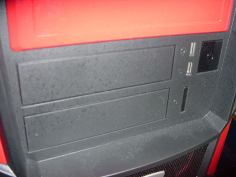
At mid-height are the 3-1/2" drive bays with simple black bay covers to make them blend into that area. To the right of the bays are the power and HDD LED's, and the large square power button to the right of those. Directly below those is the reset button, which is a narrow vertical shape that is difficult to press if you are one with large fingers. It does, however, conform to the shape of the power and HDD LEDs directly above it.
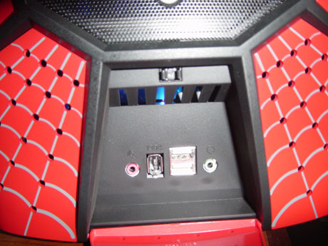
At the bottom of the Xpider II is a flip-down door, which hides the audio, USB, and FireWire ports. The door itself is painted with a web design to match the bottom 1/4 of the case bezel. It also has holes that allow the front mounted fan to pull air into the case.
Above that area is a black mesh metal grill, which is the main intake for this front mounted fan. It has an interchangeable shield shaped aluminum piece that shows off the Chenbro name. The replacement shield is made of a clear plastic and can be swapped out by removing the air filter on the backside of the case's bezel.
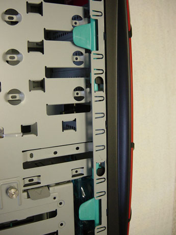
The bezel can only be removed by pulling the release clips on the inside of the case next to the drive bays.
The only other removable panel on the Xpider II is the left side panel for access to the case's internal components. Instead of thumbscrews being used to secure the panel to the Xpider II, Chenbro has implemented a mechanism that locks the panel in place easily.
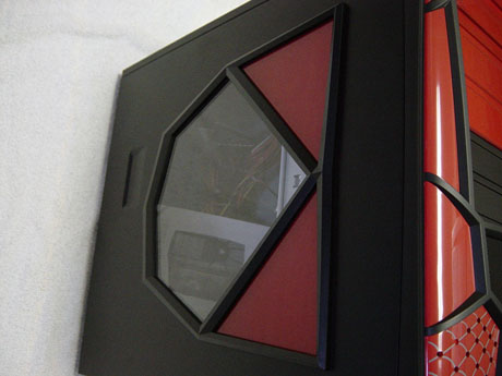
The panel itself has a diamond-shaped window and is accented by red paint to continue the cases overall look.




33 Comments
View All Comments
masher - Wednesday, August 11, 2004 - link
> with over 700 employees across the world,> Chenbro is one of the biggest manufacturing
> companies in the world.
Haha, what are you smoking? If they had 70,000 employees, they'd be one of the largest manufacturing companies in the world...at 700, they're not even a flyspeck on the map.
Booty - Wednesday, August 11, 2004 - link
Figured I might as well pipe up too - I love hearing about new cases, but really, when you reviewed this, did you actually think anyone out there would like the looks of it? Did YOU like the looks of it? I don't care if the thing has the most spacious and effecient design to date - there's no way in hell I would buy a case that looks like that. Or like the Guardian. I browse through the cases at Newegg and wonder why anyone would buy about half of them - there are so many just plain tacky designs...I'd take a nice simple Antec 3700 over this thing any day of the week. If I hadn't been reading Anandtech for so many years and this was the first review I read off your site, I'd have trouble taking you seriously and might not come back...
Maybe you guys (at AT) just have really bad taste. I look at some of the case choices in the custom-built system guides and wonder why you'd choose those over some other options. In any case, please, please stop wasting resources reviewing junky, ugly cases like this one. Case reviews are good. Ugly case reviews are bad. I don't care if the company sent it to you for free to review or what - you guys have a reputation to uphold.
Oh, and I also agree - if the case comes standard with a power supply, it should be benched/tested with that supply. If you can buy the case without the supply, that's a different story, but test it with the included hardware. If you want to then throw a different PSU/fans/whatever in to try to make the noise comparisons fair, fine... but most people who buy a case aren't just going to gut it - they're going to want to use the goods that came with the chassis.
araczynski - Wednesday, August 11, 2004 - link
reminds me of a similarly named one a month or so ago... don't think its the same company, but obviously this company didn't bother to read this site before just randomly deciding to send their case to be reviewed here.anyway, i would say the only thing missing is a little UV Spider dangling on a thin strand of UV web from inside there, at least then the design would get a smile rather then a cringe out of me.
brian_riendeau - Wednesday, August 11, 2004 - link
I have no idea who some of these case article are targetted at. I do not know anyone that would dare show up to a LAN party with a case that looks like this.Is anyone coming to this site actually interested in a plastic bezel spider case that looks like it belongs to a 5 year old? Why not start reviewing Barbie and Pokemon computer cases too???
Creig - Wednesday, August 11, 2004 - link
I agree with #4. If you swapped out the power supply to equalize noise comparisons, why didn't you swap out the case fans as well? And I don't recall previous video card reviews saying that they swapped out the cooling fan, either.At the very least, do a before/after set of readings so people who are thinking of ordering the case/power supply combo can gauge the difference between the two.
Just an idea.
Aquila76 - Wednesday, August 11, 2004 - link
Why is the market flooded with these "gamer" cases that look like something out of a 70's gay porn movie?Just a thought, but if you spend less time building these atrocities and more time building the cases we do want, you'll actually have better sales which translates to more money, which translates to hooking up with more women (or men, if you like this case), which translates to less time to come up with these hideous designs.
TrogdorJW - Wednesday, August 11, 2004 - link
I'm not at all convinced of the "growing trend" in removable motherboard trays. Yes, they exist, but they're generally only in very expensive cases. I can see where they might be somewhat desirable, but I swap out hardware relatively often and have never felt overly distressed by the lack of a removable motherboard tray. Let's be honest: if you're removing the motherboard, it's going to be something of a pain in the ass with or without the tray. The only thing it helps with would be the installation/removal of a CPU, as getting a CPU out when the motherboard is installed is very difficult.Maybe other people swap CPUs and motherboards frequently, but I usually only do it once or twice a year at most. I can deal with the non-removalbe tray for those times when I do remove the motherboard. A bigger concern for me is the fugly exterior and the LED fans. But I'm not the target market for this case. I believe the target market is kids with purple hair, nose rings, bad vision, and access to mommy and daddy's credit card. ;)
MDE - Wednesday, August 11, 2004 - link
Cable management 101: Don't put the giant ATX cable right next to the CPU heatsink...skunkbuster - Wednesday, August 11, 2004 - link
the message is clear! its DAMN FUGLY!ProphetCHRIS - Tuesday, August 10, 2004 - link
It comes right after the Guardian in my list of the worst cases ever....